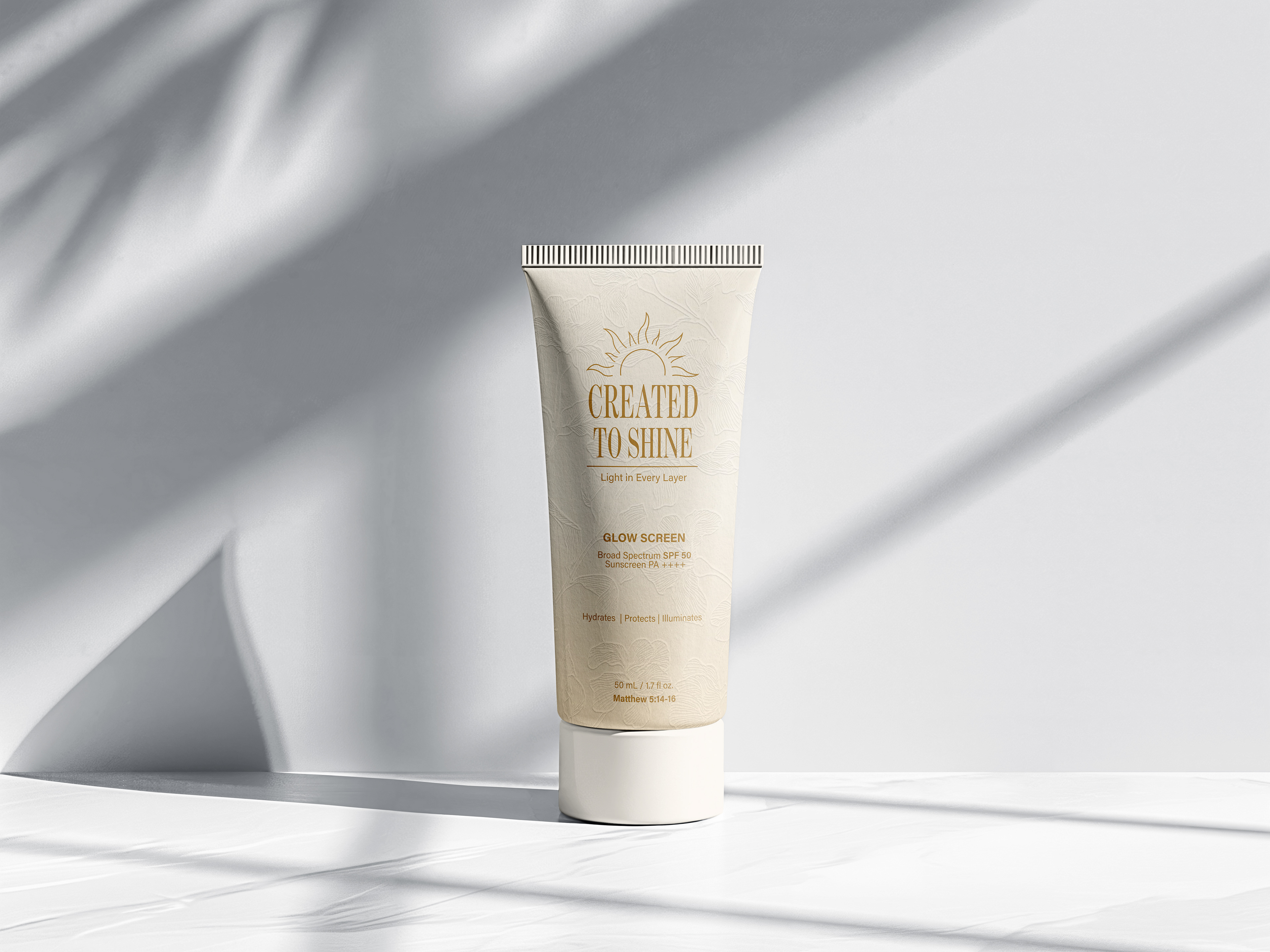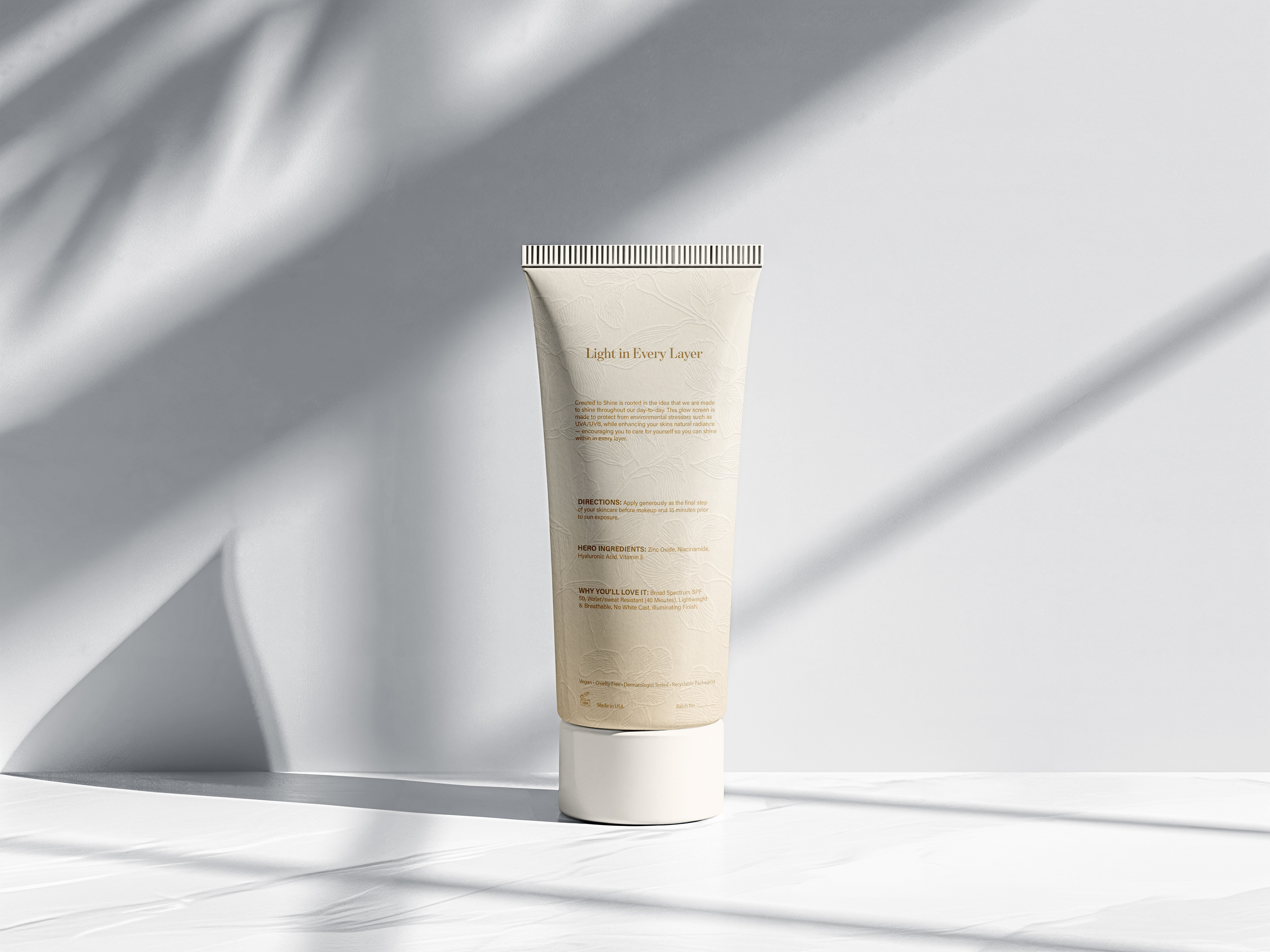
OBJECTIVE: To create a cohesive skin care brand that transforms a fictional SPF into a visually elevated experience. The brand inspired by the idea that confidence starts with taking care and protecting your skin. Through luminous colors, thoughtful packaging, and expressive type, the project represents that we're all created to shine.
Research & Exploration: Initial research and exploring visual directions.

Typeface Studies

Benton Modern D Semibold: I chose this typeface for its elevated, refined character. It has a strong serif which adds a sense of sophistication while maintaining a neat, approachable feel.
Acumin Variable Concept: I chose this typeface to create a clean and simple foundation. It balances well with Benton Modern D while keeping the overall typography feeling cohesive and minimal.
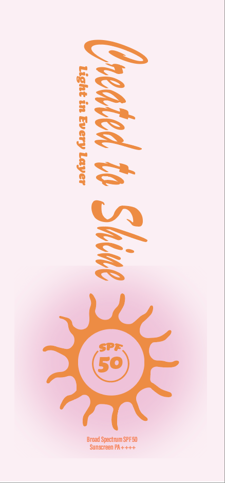
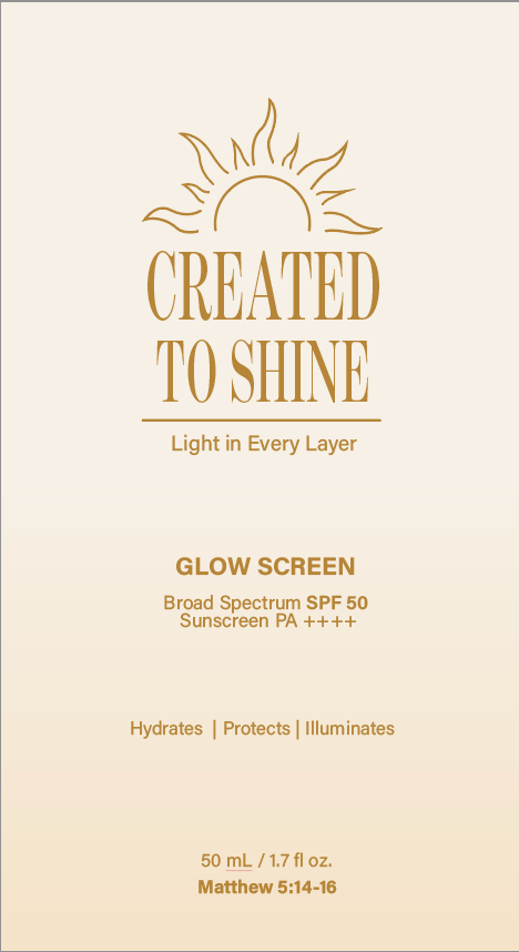
Front Iterations
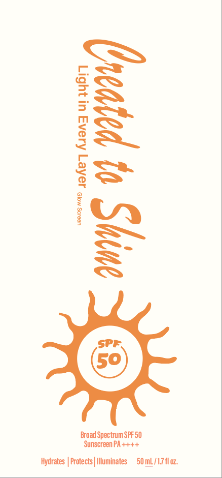
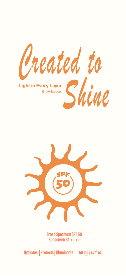
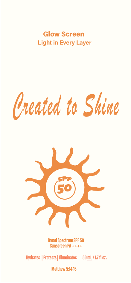
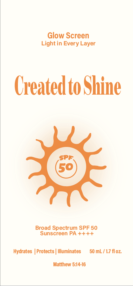
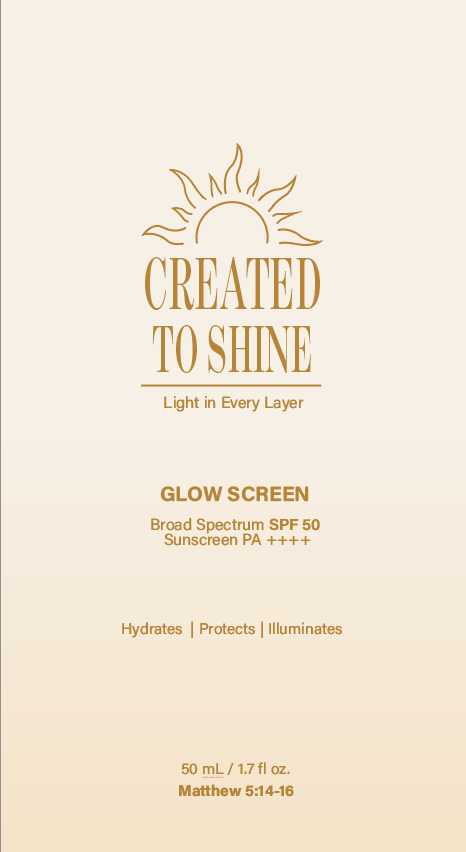
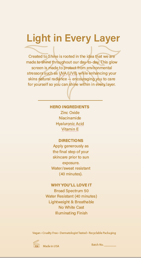
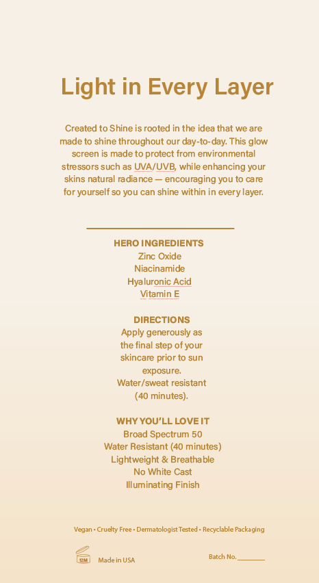
Back Iterations
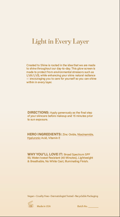
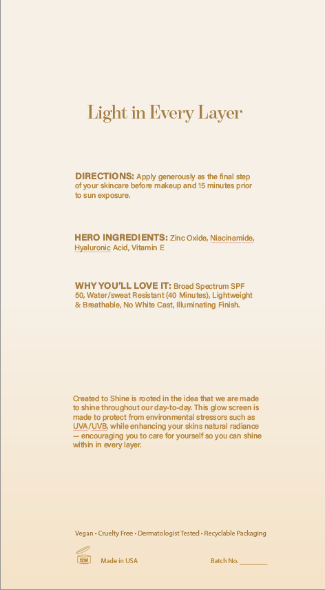
Final Iterations
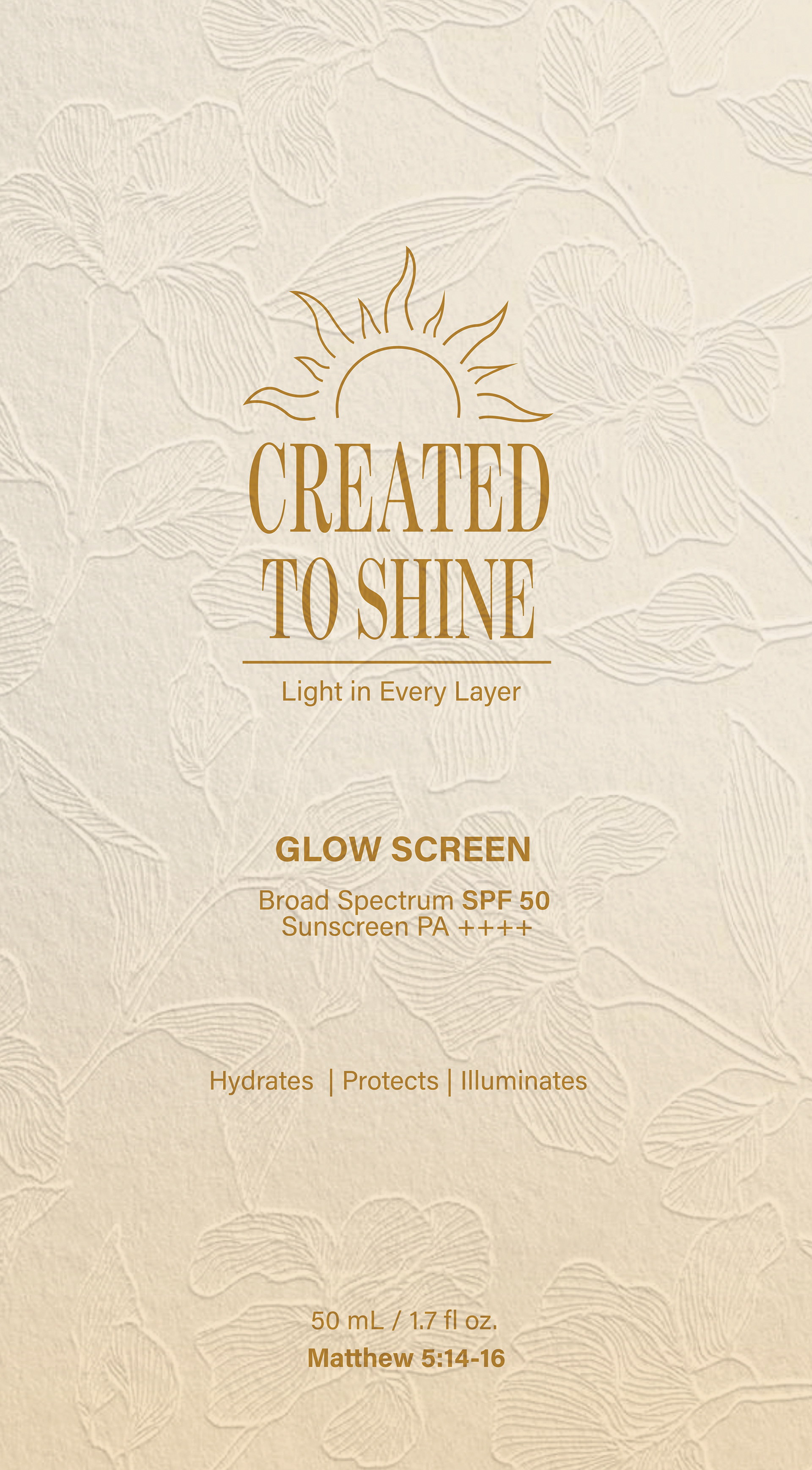
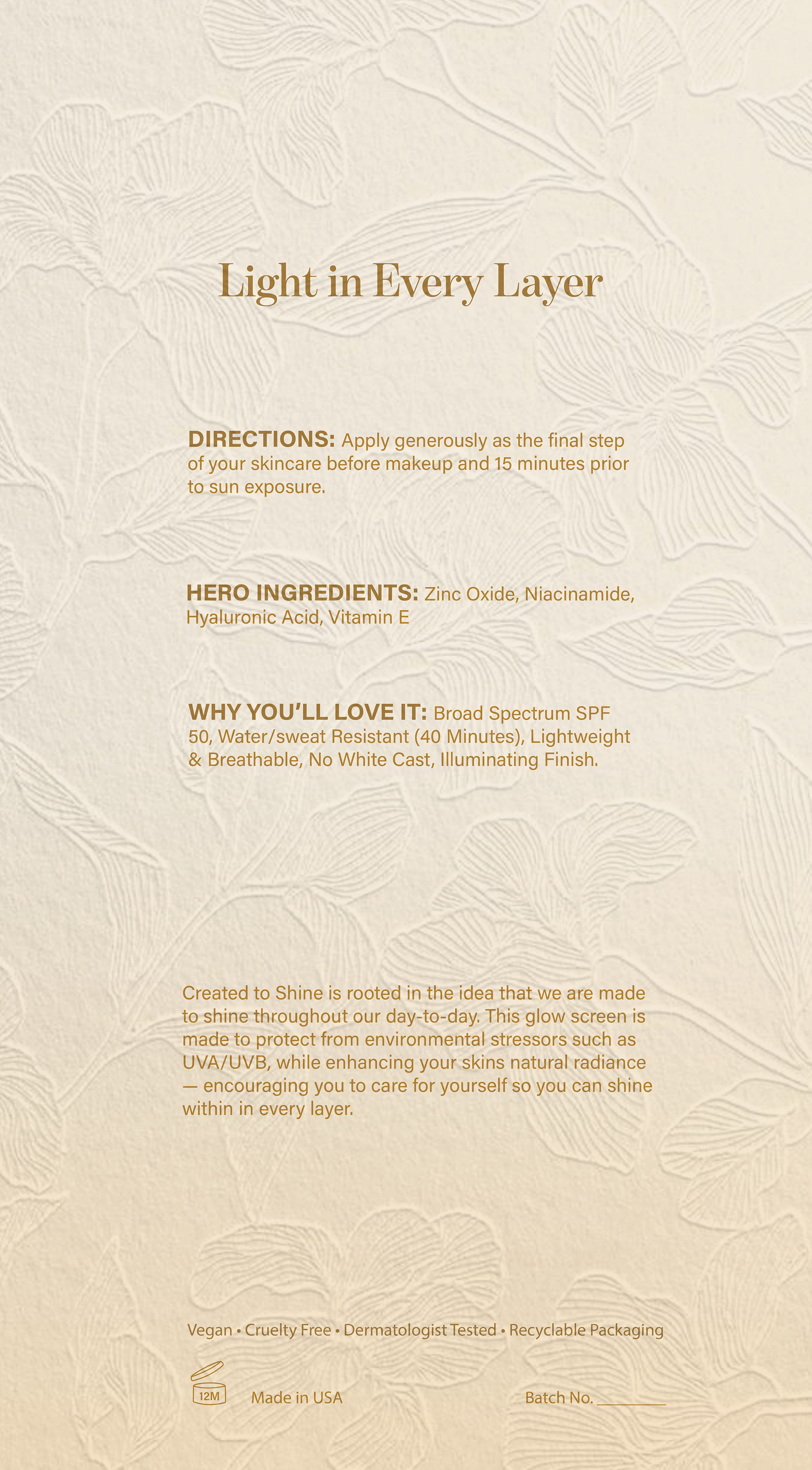
Application:
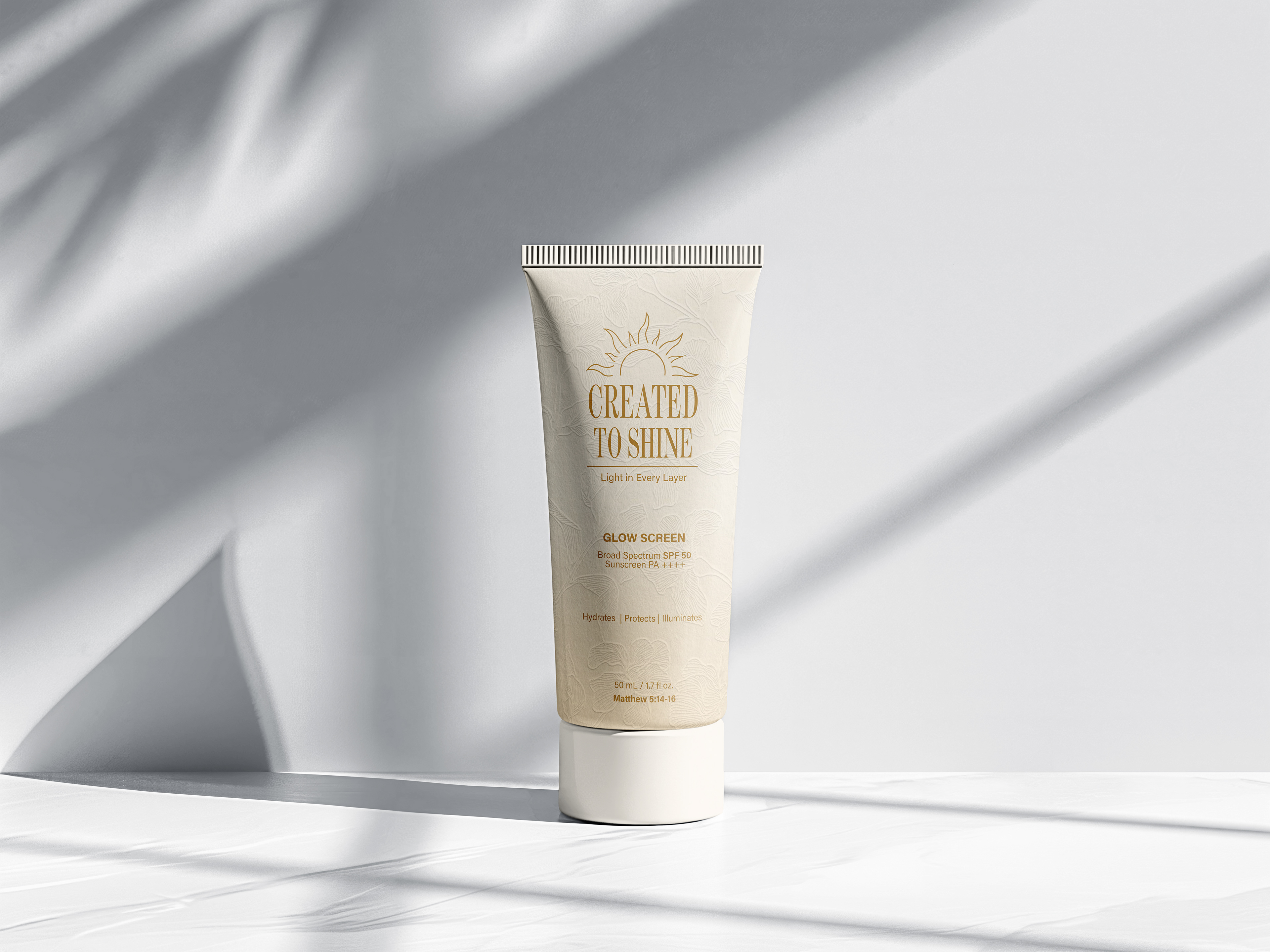
The design was placed on a mockup to show how it could work in real-world settings on a real bottle.